Introduction
If the function is the key to attracting customers' interest, detailed design is the key to retaining users. The purpose of Micro-interactions is to make users feel comfortable. Every great product is composed of countless Micro-interactions. Furthermore, Micro-interactions even reflect the tone of the entire product.
Project Goal:
To develop a series of creative and expressive micro-interactions based on a brand and go well beyond 'usable' to achieve 'delight.'
Project Scope:
Users will use these interactions on the brand's website to enhance the user experience.
Brand
Uber Eats is an American online food ordering and delivery platform launched by Uber in 2014 and based in San Francisco, California. Users can read menus, reviews and ratings, order, and pay for food from participating restaurants using an application on the iOS or Android platforms, or through a web browser. Users are also able to tip for delivery. Payment is charged to a card on file with Uber.Meals are delivered by couriers using cars, scooters, bikes, or on foot. It is operational in 32 countries.
Emotional Descriptors
fresh
natural
friendly
organic
trustworthy
Visual Descriptors
clean
simple
two dimensional
contrast
energy
The Big Button
This button is the beginning of the interaction. It sets the tone for the rest of the experience, and the visual cues from this button inform the more subdued, practical interactions that follow. This isn't the most frequently used button in the app, but it's the most embellished. It's the fancies, the one with the most going on. This button is definitely NOT generic. This button takes up much space. Space that wouldn't be available in the midst of a screen deeper in the app. This button also takes up more of the user's time and attention, so it would be a disruption and a distraction if it were used often in the middle of a complex process.
Menus
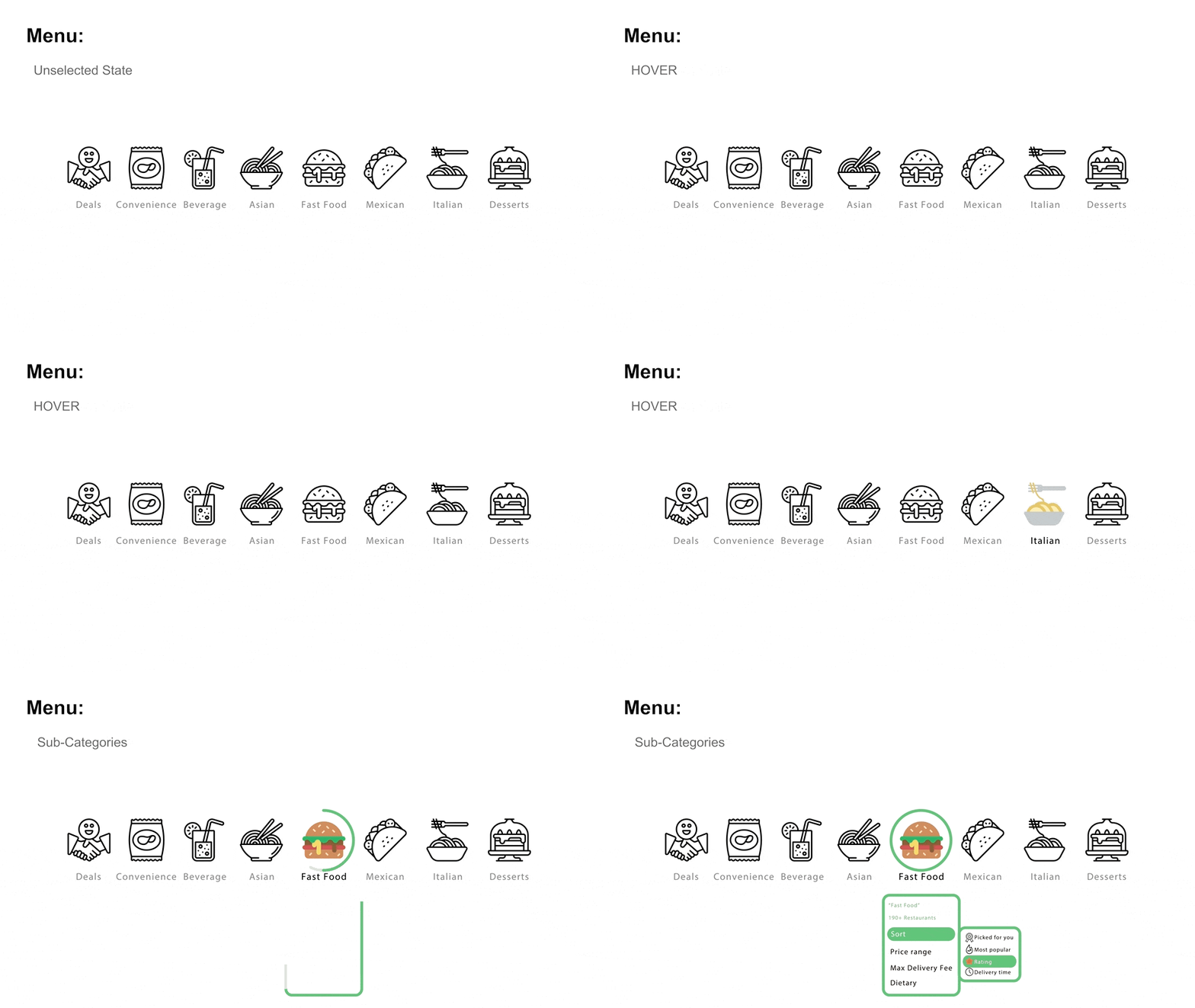
Menus enable direct and efficient navigation through applications. As the scope of content demands, menus that expand from these top-level labels provide users with quicker access to deeper content. Here I fill in the color of the icon to let users understand the type of their choice.
Radiobuttons
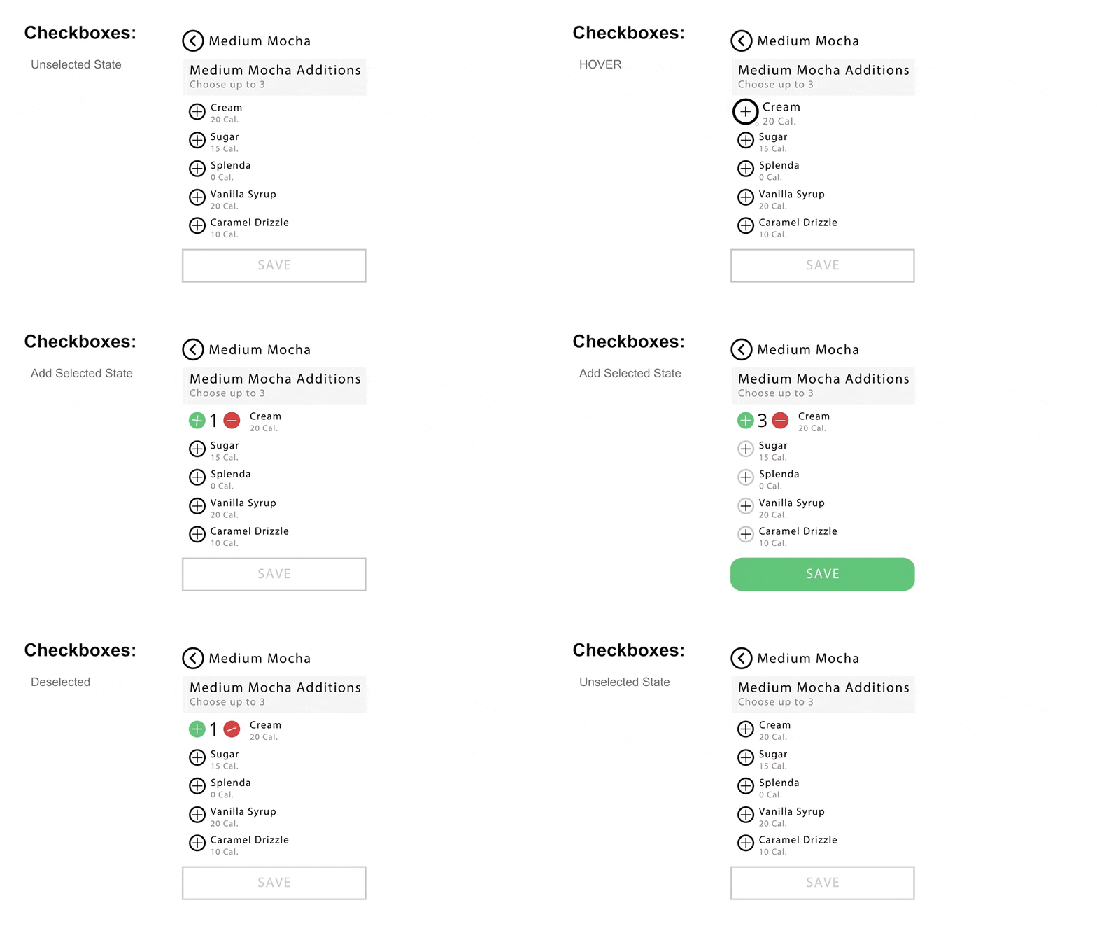
Use selects from multiple choices, but only one item can be selected. If the user selects a second item, the first is automatically deselected.
Wait Timers & Loading Indicators
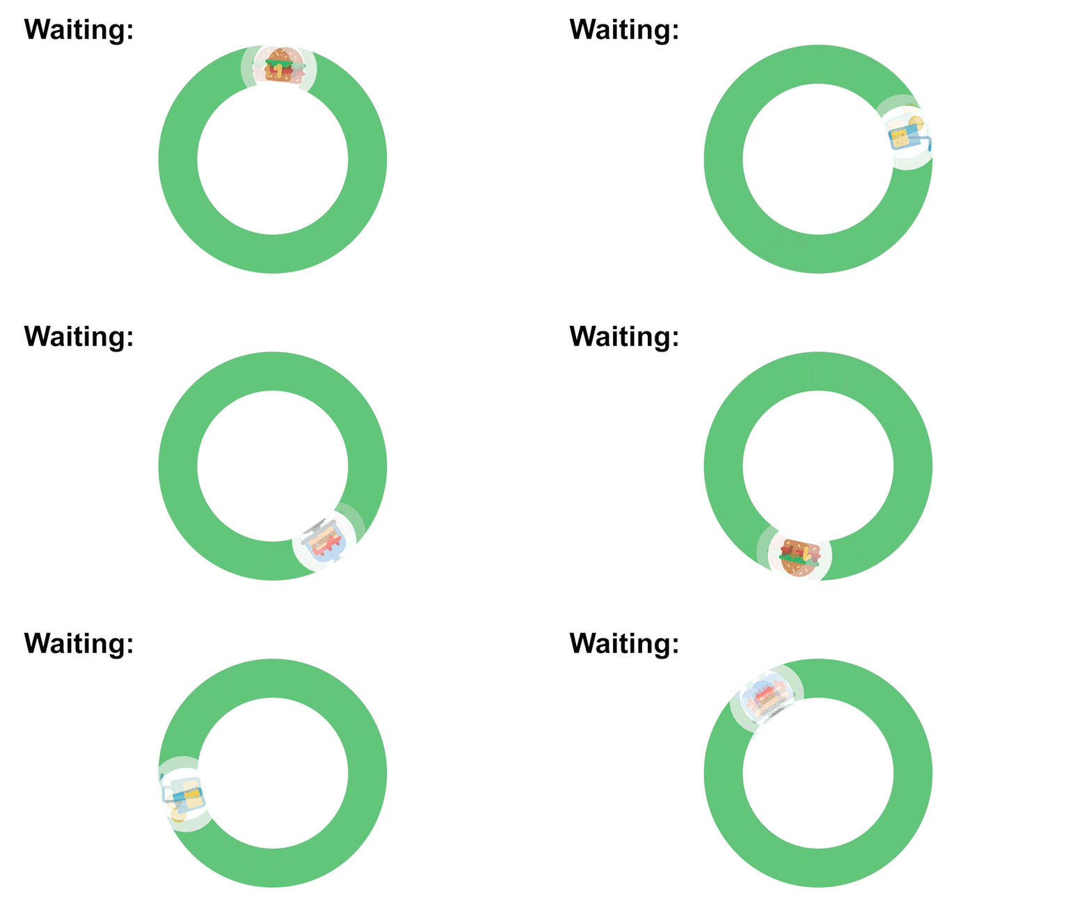
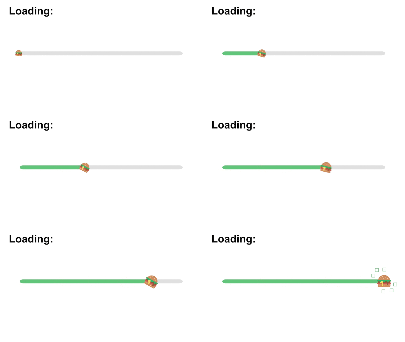
Both UI elements provide the user with some basic feedback regarding system status. They’re not interactive, in that they do not allow the user to affect operation. They’re only information for the user, but they’re still valuable parts of a UI design. Loading and wait are somewhat different in their purposes and therefore require somewhat different approaches to their design. They both tell the user to wait, to be patient, the system is working.
Toggle switches & Sliders
-
Toggle switch
Toggle switches are binary switches. On and Off.No in-between. Ideally, both modes are visible to the user. When the user clicks the button, the button's size is changed to achieve a more vivid sliding dynamic.

-
Multi-Position Switches
Multi-Position Switches designs to go beyond a basic binary choice to three or more options.

-
Slider
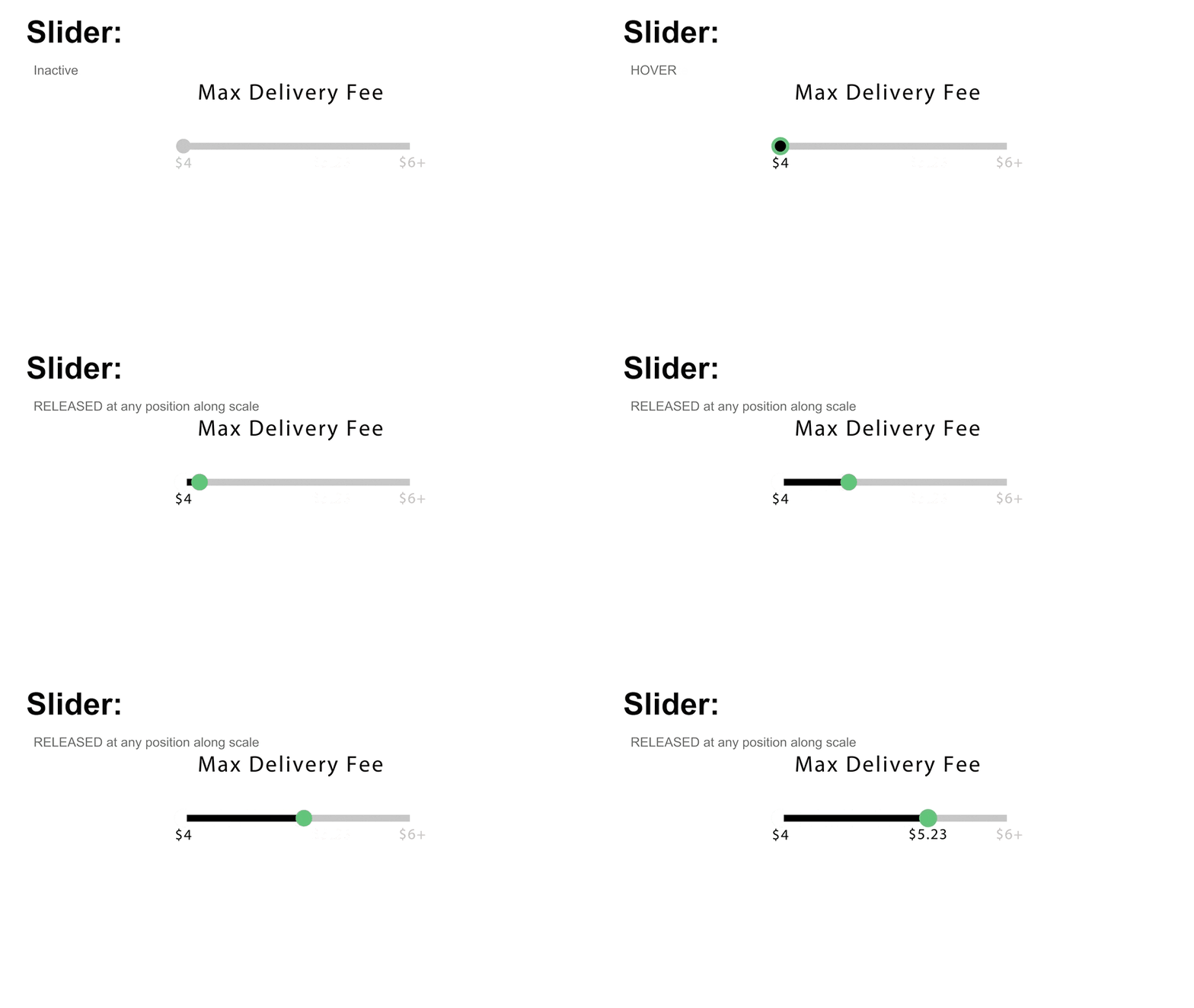
Sliders are inherently analog, not digital.Here we can set Max Delivery Fee through sliders.
Reflection
This project provides me with a good opportunity to truly understand and use micro-interactions. In the process of making micro-interactions, what makes me feel the most is that the details in these designs can bring cohesion to the entire product.

